Key structural elements of the Kent website are the global header, site menu, global footer, side menus, and key fact asides.
Global header
The global header uses the main corporate blue, the corporate all-caps Century Schoolbook font, and the University logo.
When each of the three key links is expanded you see a panel detailing further links and information.
Note that the expanded panel uses the same basic building blocks as in the feature and content panels, and editorial content. So we have chevron links and bulleted lists. The background and font colours are consistent.

The corporate blue global header with expanded heading panel.
Site menu
A site menu appears under the global header and represents a bar showing the site title, and a horizontal list of key links for that site (desktop), or a vertical list that can be expanded on mobile.
The site title bar is a mid-blue (#5973aa) with the site title in white and uppercase.
The site navigation bar is a standard light blue colour (#f1f4f9) and has its own unique way of highlighting links on hover or when the selected page is currently being viewed: making them a slightly darker blue (#e3e8f1).

Each site has a bar showing the site title, and a series of horizontally arranged key links.
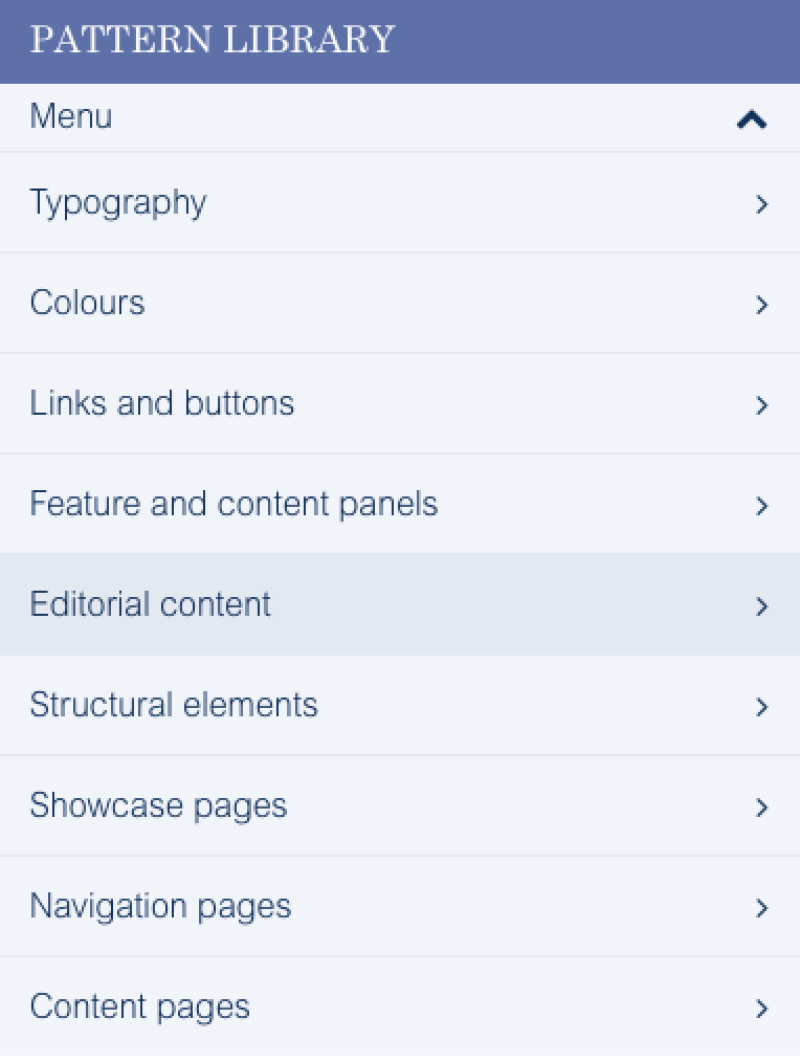
On mobile the bar appears initially collapsed, but can be expanded to give a vertical list of key links. The colours used are the same as for the desktop version.
Global footer
The global footer has common design elements: chevron links and social media buttons. However use of the black/grey background colour is unique. It makes it clear that the global footer is a different design element in its own right, and a little separate in use.
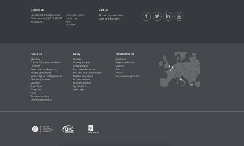
The global footer has many standard design patterns, but is slightly distinct.
Side menus
You can see an example side menu to the right of the page (desktop), or below this section of text (mobile).
Side menus are vertical lists of links, separated by horizontal lines.
Key fact asides
Some pages - such as staff profiles or course detail pages - can have asides which show key facts.
These are shown with sub-headings in bold, with some kind of icon representing that key fact (for example a map pin or clock).
The icons are drawn from our Kent Font: a standardised set of icons including the University logo and other useful icons and logos.
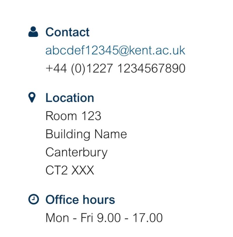
An example of an aside element taken from a staff profile layout, showing key pieces of information.

