Feature pages are used as a showcase. They have their own set of panels, ranging from image-based panels to panels with cards, and panels with just text.
The main focus for feature pages is to present primarily visual content. But the rhythm of the page can be broken up using text in between highly visual sections.
Two types of panels
Feature pages essentially have two types of panels: ones which have an image and run full-width across the page (feature panels), and ones which are made up mainly of cards or text (content panels), and which don't run right across the page.
We generally try to alternate these types of panels so the page flows nicely, with plenty of space for different types of content to stand out.
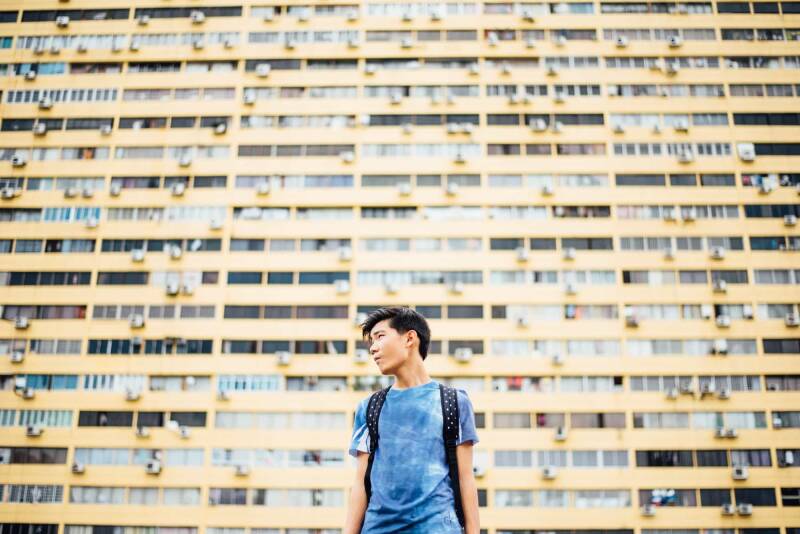
Editorial panels
Editorial panels are probably the most useful type of feature panel. They allow you to combine an image with text and buttons in a variety of ways and styles.
Editorial panels
Editorial panels let you have a good balance between an image and a short amount of text. You can even include a couple of buttons to link to other content.
Editorial panels let you have a variety of colours for the text background: red, blue, yellow, red, green, solid or translucent colours, or a frosted transparent effect.
Text can be white or dark, depending on the image, or floated left or right over the image.
You can also use the panel for quotes, simply by turning on a switch which makes the title appear with bold quote marks.
As such editorial panels are great default panels to use on a wide variety of marketing pages.
Hero panels let you also combine text and images. They are similar to Editorial panels and are often used in the header as a title to the showcase page. They include some extra optional features, such as a search panel.
This is a text content panel. Its purpose is to provide people with slightly more detailed information about the things this page is promoting.
Visually text panels help break the page up, allowing some space for the eye to focus on the page's key images without being overloaded.
You should try to keep these text sections concise - maybe just a couple of paragraphs or a hundred words or so. Any longer and people probably will just scroll past.
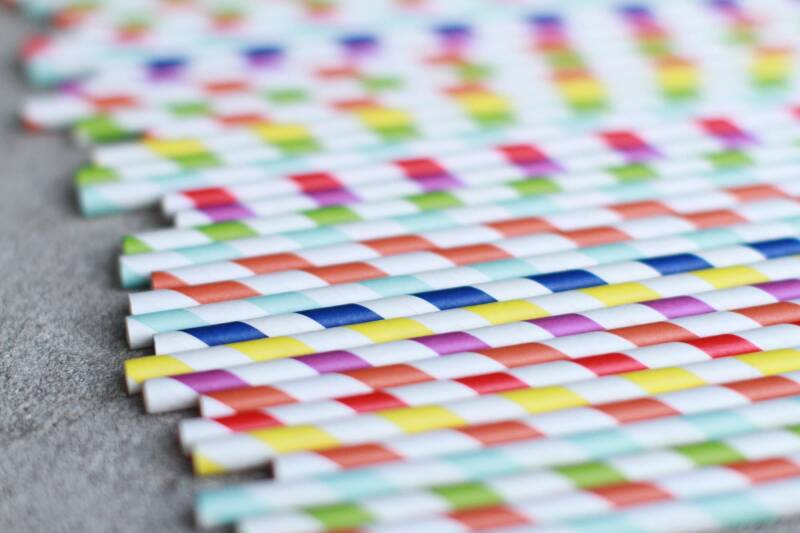
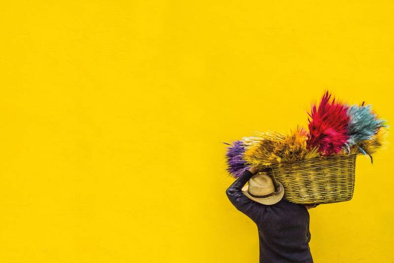
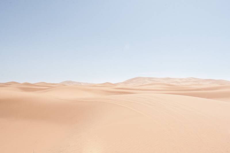
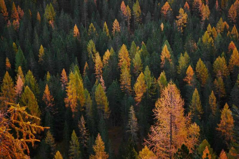
Editorial panels can be used to add a bit of textual context to a prominent image.
The image brings visual focus to the story you're promoting. The text explains the story.
Try to keep your text to about 100-150 words. If you feel you need to write more you should probably write a separate page with more detail on it, and link to that page in your text.
You should also try to use an image which works well if it's partially obscured. So for example choose a fairly abstract image, or an image where the main focus is to one side. Portraits generally don't work well in this context.
Occaecat proident dolore cillum reprehenderit reprehenderit ipsum occaecat
Firstname Lastname - BA (Hons) Coursename
Side menus
Panels of text can also have side menus. These can be useful if you want some text between your feature panels that have a few prominent links to related content.
You can use a mix of side menus and different styles of featured links (primary, secondary or chevron links) to provide different ways to show links to related content.
A social media quote lets you quote something from social media.
Map panel
The map panel lets people show a Google map in a feature panel.
Call-to-action panels
Call-to-aciton panels always have a button with a key action for the user to follow. These panels are useful for campaigns or promotional material where you want people to carry out some key steps, but you want to present the link or button in a visually arresting way.
Call-to-action panels work really well at the top of feature pages.
These panels let you promote four key numeric facts, with some explanatory text. They are particularly useful if you want to show off some stats about your site in a visual way.
Key facts
100%
ipsum do consequat cillum ex duis excepteur aliquip.
100%
ipsum do consequat cillum ex duis excepteur aliquip.
100%
ipsum do consequat cillum ex duis excepteur aliquip.
100%
ipsum do consequat cillum ex duis excepteur aliquip.
Image gallery panels
Image gallery panels let you add a whole group of images to a flexible grid-like gallery.
They are particularly good where you have more than about ten really impactful images which you want to display without any text.
Each image can have some caption text about it which people can see once they click on an image in the gallery.